
A professional mobile menu for your WordPress site — lightweight and simple.
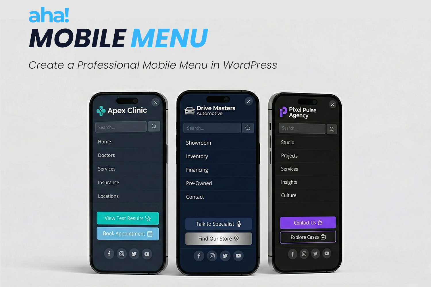
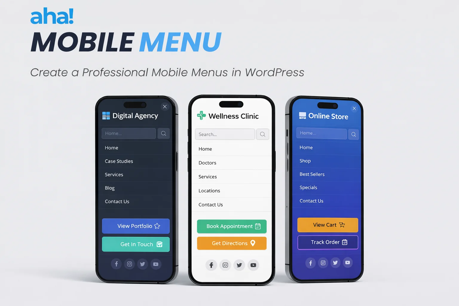
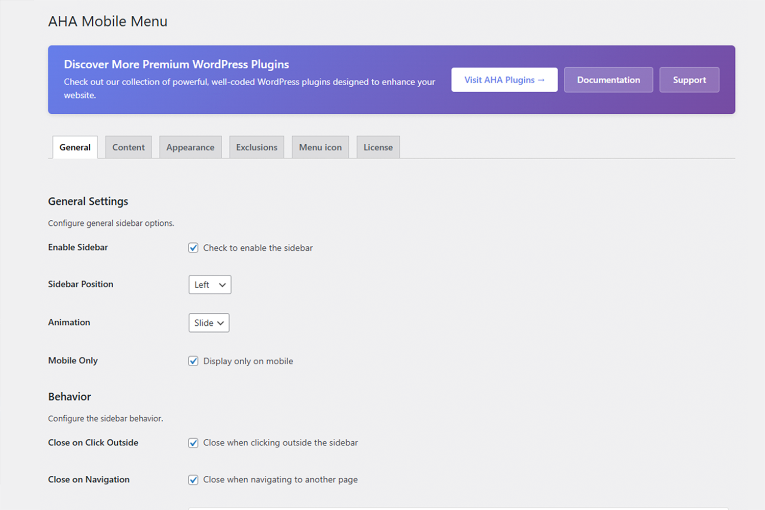
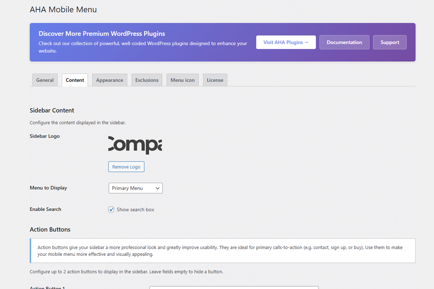
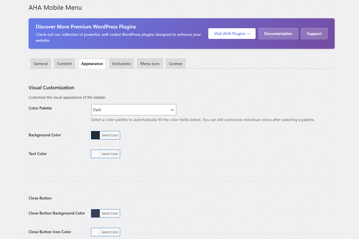
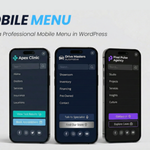
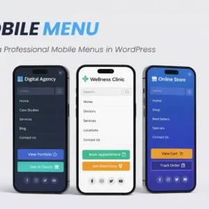
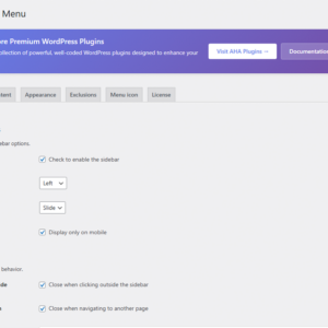
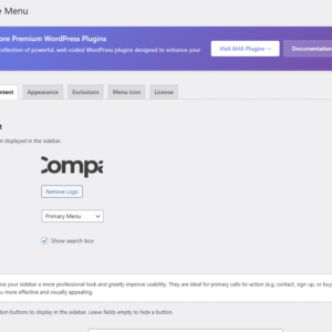
AHA Mobile Menu is an off-canvas sidebar plugin for anyone who wants clear, fast mobile navigation without depending on the theme or slowing down the site. It works on phones and tablets and, if you want, on desktop too. You choose the WordPress menu, add a logo, search, and social links, set colors and animation — and in a few minutes the menu is live.
What you have in your hand
- Off-canvas menu — The menu slides in from the side (left or right), freeing the screen and keeping focus on your content.
- Lightweight and performant — Minimal JavaScript and CSS; it won’t slow your site down.
- Compatible with any theme — Use it with classic themes, block (FSE) themes, or headless setups; the plugin fits into what you already have.
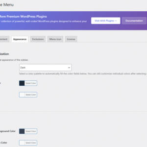
- Visual configuration — Ready-made palettes (dark, light, blue, green, etc.) or custom colors; slide or fade animation.
- Flexible content — Logo, WordPress menu, search box, and social icons in the same panel.
- Fine-grained control — Show only on mobile or on desktop too; exclude specific pages or post types where the menu shouldn’t appear.
-
Pro addon (optional) — Adds up to 2 configurable action buttons (e.g. “Contact”, “Sign up”) with optional icons, managed via license tab.
Who is it for?
- Website owners who want a professional mobile menu without depending on the theme.
- Agencies and freelancers who build websites in WordPress and need a stable and easy-to-deliver solution.
- Developers who prefer a lean plugin with hooks and filters, instead of an “all-in-one” solution.